Sailing Course / Module 4 / Navigation - Chart Work Basics

Lesson 2 - Charts

OBJECTIVE

This lesson introduces you to a standard nautical chart and the features/information it contains. By the end of the lesson, you will be able to find and understand the main features/information contained on a nautical chart.


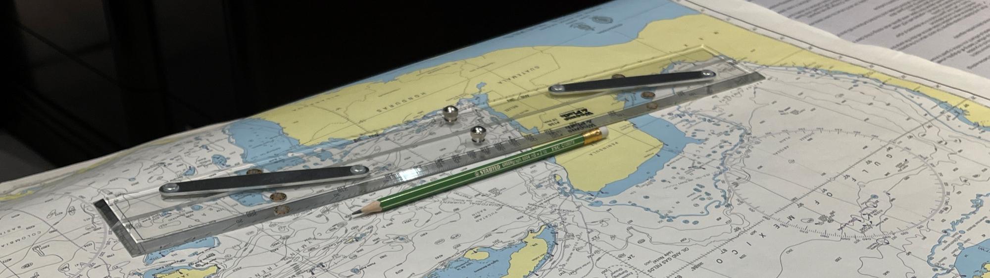
A nautical chart is a map of the sea bed and adjacent land used in navigation of a vessel.

They contain an enormous amount of information in both writing and pictures necessary for navigation. In order to avoid the chart becoming cluttered the writing is often abbreviated so navigators must be able to understand the abbreviations and symbols at a glance.


Charts are produced by the hydrographic agencies, normally by the maritime country that produces and maintains the hydrographic data and information. However, some smaller countries do not have the means to publish their own charts, so supply their information to agencies of other countries to produce.


In the UK, it is the UK Hydrographic Office (UKHO), who sell their products under the brand name 'Admiralty Charts and Publications'. UKHO produces charts covering UK and some commonwealth waters in detail and with reduced coverage elsewhere. While in the US, the charts are published by the National Oceanic and Atmospheric Administration (NOAA).


To determine what charts you need for your cruising area, the hydrographic agencies produce free chart catalogues, both paper and digital. 


FUN FACT

The first navigation charts (called Portolan maps at the time) were made at the end of the 13th century and depicted the main trading ports in the Mediterranean basin. 100 years earlier the magnetic compass came into use and this is considered to have been the catalyst for the development of charts. Prior to this sailors relied on documented landmarks known as “Sailing Directions” and, of course, celestial navigation.


Projections

As the earth is not flat (contrary to the belief of some), it presents distortion issues when producing a 2D map or chart. To represent a curved surface on a flat one there are many different ways, these are known as projections, each with its own characteristic set of distortions. The projection used depends on what distortion is most acceptable on the finished chart.


One projection, known as Mercator's projection, is particularly good at representing direction. This is a purely mathematical concept, but is easily visualised by imagining the image cast on a sheet of paper wrapped around a globe with a bright light in the centre. This distorts the meridians to appear as vertical parallel lines, intersecting with the lines of latitude at right angles. Distances are therefore distorted, particularly towards the poles, where the meridians on the world converge and eventually meet. On a Mercator chart, the meridians never meet, so east-west distances near the poles are exaggerated.


The common solution to the problem of representing polar areas is to use an alternative projection, known as gnomonic projection. Similarly, to Mercator's projection, it is a mathematical concept that is easily visualised as the image that would be produced by a translucent globe, with a bright light at its centre, standing on a flat sheet of paper. The globe could touch the paper at any point, but for polar charts it is best to touch at the pole itself. This point of contact is known as the tangent point.


On any gnomonic chart, the meridians appear as straight lines, while parallels of latitude appear as curves. The overall pattern varies considerably, depending on where the tangent point is located. That is, if the tangent point is at the Equator, the meridians appear as straight parallel lines, but if the tangent point is the Pole, the pattern shows the parallels of latitude as a series of concentric circles. The gnomonic projection is the only one on which the shortest distance between two points (known as the great circle route) appears as a straight line. For planning ocean passages, particularly those with a large east-west movement. the distance saved can be significant.


Scale

Scale is the relationship between distance on a chart and the distance it represents. So, if 1cm represents 2km, distances on the chart/map are 1/200,000, and the chart/map could be described as being at a scale of 1:200,000. If 10cm on a chart/map represents 1 km, it shows considerably more detail, but the paper size would need to increase to show even a small area and its scale would be 1:10,000.


It is essential to choose the right scale chart for the intended voyage. Scales are typically between 1:5,000 and 1:25,000, and are used for harbour plans and port approaches. Conversely, small scale charts are used for planning purposes, at scales down to about 1:3,500,000. It is useful to note that coastal navigation charts are usually at scales of between 1:75,000 and 1:150,000.


TAKE NOTE

A good way to understand the scale on a chart, is to imagine an apple cut into slices. The more slices you cut, the larger the quantity of slices, but the less apple you get with every slice.  So, to relate this to a chart... the larger the scale, the less detail (or apple) you get. 


Charted Information

Charts contain a huge amount of information: coastlines; depths, represented by contour lines and spot soundings; heights; details of navigation aids such as lighthouses and buoys; hazards such as underwater pipelines and cables, as well as rocks and sandbars; some rules and regulations such as traffic separation schemes; prohibited areas and forbidden anchorages; and, supplementary information such as the type of seabed and facilities available ashore.


Symbols and Abbreviations

Symbols and abbreviations are used on charts to save space but also to highlight the important/useful navigational features. For example, a 200m tall chimney that stands out against the skyline and is illuminated with red lights at night makes an excellent landmark… its base, however, may only be 25m in diameter, so even at the scale 1:25,000 it would be represented by an inconspicuous dot with a 1mm diameter. To overcome these problems, symbols are used.


Each hydrographic agency issues a definitive list of symbols, and publishes these for clear reference, for example, “Symbols and Abbreviations Used on ADMIRALTY charts” (NP5011). These publications give details on symbols and abbreviations used on charts, and also contain information on hydrography, topography, navigational aids and services. Most hydrographic agencies use similar symbols and abbreviations, as well as providing the publication in both digital and paper formats.


Electronic Charts

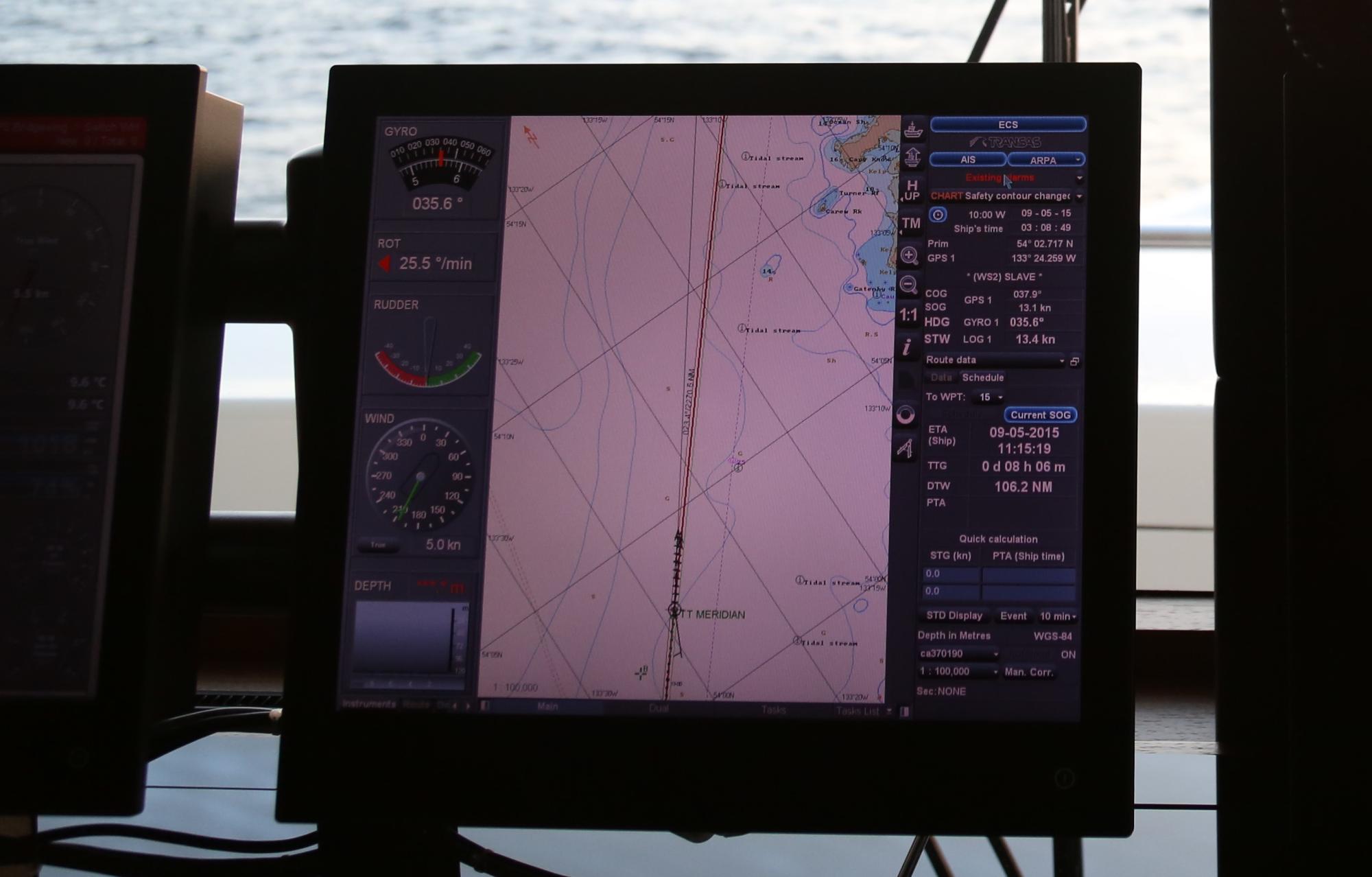
The digital era is upon us, thus the idea of paper anything these days is almost considered a crime. Thus, the digitising of nautical charts has become common practice in the form of electronic chart systems (or chart plotters) and makes them an excellent practical tool on small vessels with no room for large chart tables. Though it should be noted that the starting point for the production of any electronic chart is likely to be its paper counterpart.


The big advantage of these systems is that when linked to an electronic position fixer such as GPS, they show the vessel's continuously updated position. Their biggest drawbacks are that they are potentially less reliable and less intuitive than traditional paper and pencil, as well as being a cybersecurity risk.


Type of Chart – Raster vs Vector

The International Maritime Organization (IMO) published a comparison of raster and vector charting systems in 1999, the following categories were defined:


ECDIS = Electronic Chart Display and Information System (vector)
RCDS = Raster Chart Display System (raster)
ENC = Electronic Navigational Chart (vector)
RNC = Raster Navigational Chart (raster)
GNSS = Global Navigational Satellite System


Raster charts are digitised by scanning a paper chart. This means that each tiny segment of each line on a chart is converted to a raster picture element or pixel. So, much like a television picture, the greater the zoom the more pixelated the image.

ENCs are vector or "smart” charts and are coded with additional information not available on paper or raster charts. ENCs carry a wealth of geo-spatial intelligence through a database of information associated with them. On an ENC the user can click on different features, such as a light or buoy, and retrieve additional information about the feature.


Chart Updates

Whether paper or digital, all charts require regular updating and should not be used for navigation if they are not. Rather than publishing new charts, corrections to the existing published charts are provided by hydrographic offices. These changes are published by way of weekly “Notices to Mariners” (NTM) and should be confirmed as applied prior to the chart being used.


Publications

While charts are the main source of information for navigation, there are many other useful reference books, or “publications”.

These include:

  • Tide Tables;
  • Tidal Stream Atlases;
  • List of Lights;
  • List of Radio Signals;
  • Nautical Almanacs; and,
  • Pilot and Sailing Directions.

All of these publications are important and should be referred to, in the planning of any nautical passage.


SUMMARY

You now have an understanding of the main features/information contained on a nautical chart and where on the chart this information can be found.


There are two types of charts: and vector.